Mobile friendly test google: A Practical Guide to Master Mobile SEO

Even though Google’s standalone Mobile-Friendly Test tool is a thing of the past, the principle behind it is more critical than ever. The simple truth is that Google now overwhelmingly uses its smartphone crawler to index and rank websites. This whole shift is what we call mobile-first indexing.
If your site isn't built for a phone, it's pretty much a ghost to the world's biggest search engine.
Why Your Mobile Site Is Now Your Only Site

Let's be clear: "mobile-first" isn't a suggestion. It's the law of the land in modern SEO. Google isn’t juggling two different indexes for desktop and mobile anymore. There's only one, and it's built entirely from the mobile versions of websites.
This has massive implications, especially if you're running large-scale programmatic SEO projects. When you're managing tens of thousands—or even hundreds of thousands—of pages, getting every single one perfect on mobile isn't just a good idea. It's your only path to success. One small error in a template can torpedo your entire content library.
The Audience Is Already on Mobile
Looking beyond Google's technical rules, just think about your users. They live on their phones. If you ignore their experience, you're willingly ignoring a huge chunk of your potential market. The numbers don't lie.
Take Germany, for example. In December 2023, the top mobile sites saw staggering traffic. IPPEN.MEDIA Mobil hit an incredible 32 million unique users, and ebay Kleinanzeigen brought in 31 million. That's over 60 million unique users on just a couple of top sites, all on mobile—a massive slice of Germany's 83 million population. This audience is just too big to disregard.
Mobile optimisation isn’t about shrinking things for a smaller screen anymore. It’s about designing for the primary way both users and Google see the web. Your desktop site is now the secondary experience.
Reframing Mobile-Friendliness
Thinking of a "mobile-friendly test" as a simple pass/fail check is missing the point. It’s the very heart of user experience, a direct lever for your rankings, and the bedrock of any solid digital strategy. A site that’s a pain to use on a phone will have a tough time earning backlinks, keeping visitors around, and ultimately, making conversions. You can get a deeper understanding of mobile-first indexing in our detailed article.
The transition is complete: your mobile site is your site. Once that clicks, you can start digging into the practical steps of How To Make Your Website Mobile Friendly and build an online presence that lasts. Every single programmatic SEO project has to start with a mobile-centric mindset if it's going to succeed.
Your New Toolkit for Mobile Usability Testing
So, with Google's old standalone tool retired, how do you run a reliable mobile-friendly test today? The good news is the core functionality hasn't vanished—it's just been absorbed into more powerful, free tools. We're going to focus on the two essentials every SEO needs to master: PageSpeed Insights and Chrome DevTools.
These tools are your new best friends for mobile SEO. They go way beyond a simple pass or fail, offering a much deeper look into the actual user experience, which is what Google really cares about.
Using PageSpeed Insights for Mobile Checks
You probably already use PageSpeed Insights (PSI) to check site speed. But tucked away inside its detailed report is the direct replacement for the old mobile-friendly test. It’s a clean, simple confirmation that your page meets Google's baseline criteria for mobile usability.
When you plug a URL into PSI, make sure you're looking at the Mobile report, not Desktop. Scroll right past that big performance score at the top. You're hunting for a specific section under "Diagnostics" that will show either a green tick of approval or a red cross of doom.
Here’s exactly what a passing grade looks like inside the PSI report.
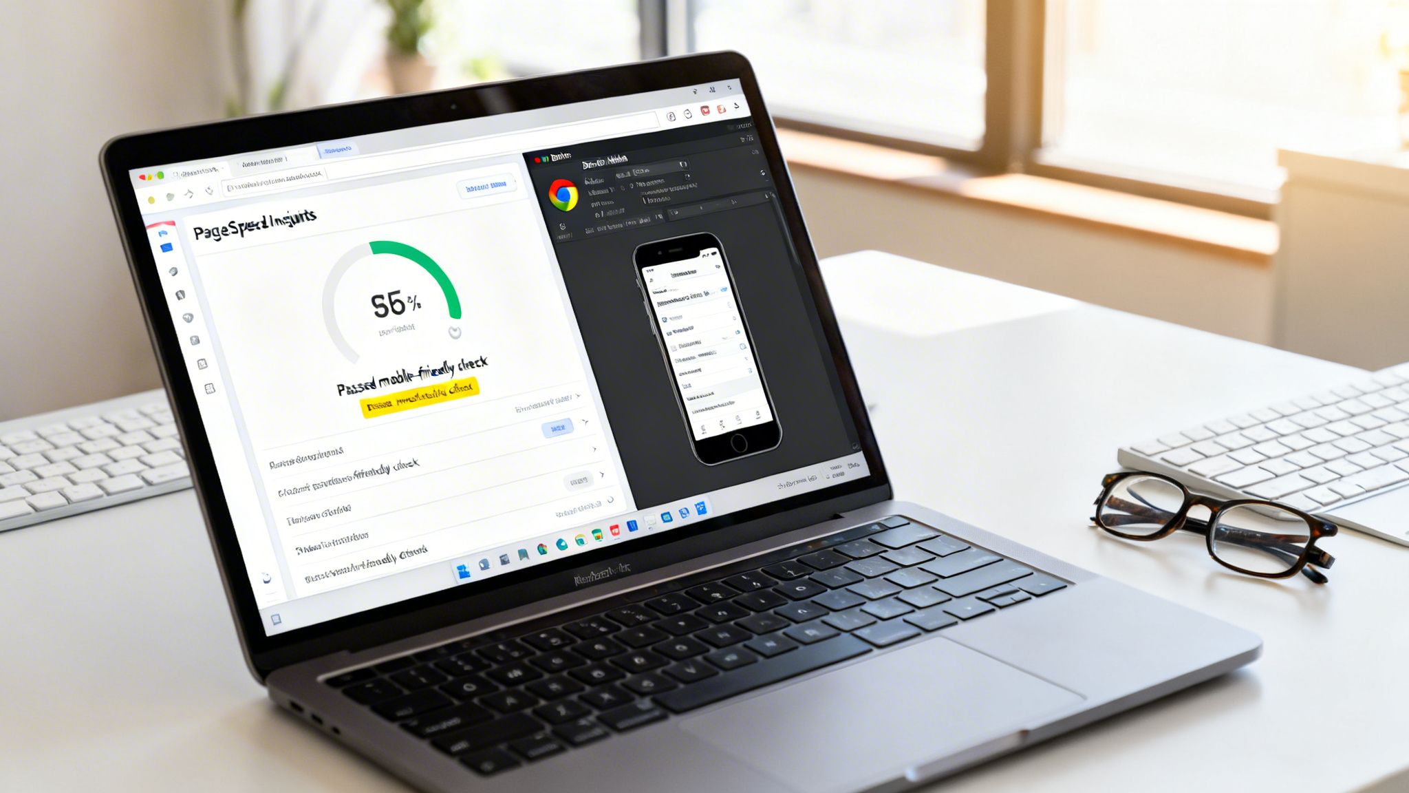
This check confirms you’ve got the fundamentals right, like a properly configured viewport and readable font sizes. Passing this is non-negotiable, but it's just step one. A truly great user experience also depends on your Core Web Vitals, and understanding metrics like First Contentful Paint (FCP) is key. The guide to Mastering FCP is a brilliant resource for that.
A Quick Comparison of Modern Mobile Testing Tools
Since the original tool is gone, it's helpful to know which tool to grab for which job. Here's a quick rundown of your best options.
| Tool | Best For | Key Feature | Skill Level |
|---|---|---|---|
| PageSpeed Insights | Quick, Google-approved checks and performance metrics. | Official "Mobile Friendly" pass/fail status. | Beginner |
| Chrome DevTools | Real-time, interactive debugging on your own machine. | Device emulation and network throttling. | Intermediate |
| Google Search Console | Site-wide monitoring and historical issue tracking. | "Mobile Usability" report for ongoing alerts. | Beginner |
| Lighthouse | Automated, in-depth audits for performance and accessibility. | Comprehensive scoring across multiple categories. | Intermediate |
These tools work best together. Use Search Console for the big picture, PSI for quick checks, and DevTools for deep-dive fixes.
Demystifying Chrome DevTools for Real-World Simulation
If PSI gives you the quick verdict, Chrome DevTools lets you actually step into your users' shoes. It's built right into your Chrome browser and provides a powerful device simulator that does much more than just shrink your screen.
Just right-click anywhere on your page, hit "Inspect," and then click the little icon that looks like a phone and tablet (the Device Toolbar).
Instantly, your browser window becomes a simulated mobile device. You can pick from a dropdown of popular models, from an iPhone SE to a Samsung Galaxy S23, which is critical for seeing how your responsive design actually adapts.
Think of PageSpeed Insights as your doctor giving you a clean bill of health. Chrome DevTools is the full-body scan that shows you exactly how everything is working under the surface. You need both for a complete picture.
But the real magic of DevTools is its ability to simulate real-world conditions. You can throttle your network connection to "Slow 3G" or "Fast 3G." This is absolutely vital. A site that loads in a flash on your office Wi-Fi might be painfully slow for someone on the move, and this feature helps you spot performance bottlenecks you'd otherwise completely miss.
You can also use the DevTools inspector to diagnose common mobile issues right then and there:
- Check Tap Targets: Hover over buttons and links. Are they big enough (at least 48x48 pixels) and spaced properly to avoid fat-finger mistakes?
- Identify Overflowing Content: See a horizontal scrollbar? That’s a dead giveaway that something is wider than the screen—a classic mobile usability fail.
- Analyse Loaded Resources: Flip to the "Network" tab. Are massive, unoptimised images bogging down the mobile experience?
By combining these two free tools, you get a robust testing process. PSI gives you the high-level, Google-approved check, and DevTools gives you the granular, hands-on power to find and fix issues. For more on connecting these insights to your overall site health, you can learn about leveraging Google Search Console for technical SEO.
Untangling Common Mobile Issues (And How to Fix Them)
Seeing a "fail" on a mobile test can feel deflating, but here’s the reality: most mobile usability issues are incredibly common. Even better, they're often surprisingly straightforward to fix. This section is your hands-on troubleshooting guide, breaking down the errors Google's tools flag most often and showing you exactly how to solve them.
Think of these errors not as failures, but as clear signposts. Google is telling you precisely where your user experience is falling short on a smaller screen. By addressing them, you're not just appeasing an algorithm; you're making your site genuinely better for the people actually using it.
The Viewport Is Not Set
First up, one of the most fundamental yet easily solved problems: "Viewport not set."
This error sounds technical, but it’s actually quite simple. Without a viewport meta tag, a mobile browser has no idea how to size your page. It defaults to assuming it’s a full desktop site and shrinks everything to fit, which leads to microscopic text and an awful user experience.
The fix? It's usually just a single line of code in the <head> section of your HTML.
This one tag tells the browser to set the page's width to match the device's screen width and to start at a natural zoom level. Adding it is like giving the browser a pair of reading glasses. It instantly knows how to render the page correctly for mobile, setting the foundation for every other responsive design fix.
Content Is Wider Than The Screen
Here's another classic, often a direct symptom of a missing viewport. The "Content wider than the screen" error means users have to scroll side-to-side to see everything. That’s a cardinal sin in mobile design.
This is almost always caused by an element with a fixed width, like a massive image or a wide data table. For example, an image with a hardcoded width of 800px will force an iPhone SE screen (only 375px wide) to create a horizontal scrollbar.
The solution lives in your CSS. Ditch fixed widths and embrace responsive units. For images, a simple and powerful fix is to set their maximum width to 100% of their container.
img { max-width: 100%; height: auto; }
This tiny snippet ensures that no matter how large an image is, it will never break out of its parent container on a smaller screen. It just gracefully scales down. You can apply the same max-width: 100%; logic to other elements like videos or tables to solve the horizontal scroll issue instantly.
You can spot these overflow problems yourself using your browser's developer tools. This screenshot from Chrome DevTools shows how you can toggle the device toolbar to see exactly how your page renders on different phones.
By switching between device presets, you can quickly find which elements are causing the overflow and jump in with the right CSS.
Text Is Too Small To Read
If your visitors have to pinch-to-zoom just to read your paragraphs, Google will flag it as "Text too small to read." This issue is directly tied to user frustration and high bounce rates.
While a missing viewport tag is a common cause, this can also happen if your font sizes are set in fixed pixel values that don't scale well.
A solid rule of thumb is to use a base font size of at least 16px for your body text. This is widely considered the gold standard for readability on mobile.
Setting a base font size of 16px is more than a design choice; it's an accessibility standard. It ensures that your content is legible for the widest possible audience without forcing them to zoom in and out.
The best way to implement this is to set the base font size on your body element in CSS. From there, use relative units like em or rem for other text elements. This lets your text scale proportionally. For instance, if your base font is 16px, setting your headlines to 1.5rem makes them 24px (1.5 * 16), maintaining both readability and responsive flexibility.
Clickable Elements Are Too Close Together
The last common culprit is "Clickable elements too close together." This is what happens when links, buttons, or menu items are packed so tightly that a user can't reliably tap one without accidentally hitting its neighbour. It’s the digital equivalent of fumbling with a tiny remote control.
Google recommends that tap targets should be at least 48x48 pixels. Just as important, there should be enough breathing room around them. A good practice is to ensure at least 8px of space between tappable elements.
Imagine a product grid where each item has a "View Details" link and an "Add to Cart" button right next to each other. On mobile, that's a minefield for fat-finger errors.
To fix this:
- Increase Padding: Add more padding inside your buttons. This increases their physical tap area without making the text larger.
- Add Margin: Use margins to create space between adjacent buttons or links.
- Stack Elements: On the smallest screens, don't be afraid to stack buttons vertically instead of side-by-side.
Nailing these four issues—viewport, content width, text size, and tap targets—will resolve the vast majority of problems flagged by a mobile friendly test google runs. But remember, mobile-friendliness also has a deep connection with page speed. You can learn more about optimising your site's performance by reading our guide on Core Web Vitals.
Scaling Mobile-Friendliness for Programmatic SEO
It’s one thing to check a single URL with Google’s tools. But what happens when you’re wrestling with a programmatic SEO project involving 10,000, 50,000, or even more pages? Manually testing each one is a non-starter. This is the point where you have to stop putting out fires and start building a fireproof system.
Scaling mobile usability isn’t about checking pages after they go live; it’s about building mobile-friendliness into the DNA of your programmatic templates from the very beginning.
Build Mobile-First Templates
The most bulletproof way to manage mobile usability at scale is to design your templates so that problems never have a chance to appear in the first place. Every component, from the header down to the footer, has to be built with responsive design in mind from day one.
This really comes down to a few core ideas:
- Fluid Grids: Ditch fixed pixel widths (px) and build your layouts with relative units like percentages (%). This lets your page structure breathe and adapt to any screen it’s viewed on.
- Flexible Images: Just like your layout, your images need to be able to resize within their containers. Often, a single line of CSS (
max-width: 100%;) is all you need to stop images from breaking your layout on small screens. - Media Queries: Use CSS media queries to apply different styles at specific screen sizes. This is how a neat three-column layout on a desktop can elegantly stack into a single, scrollable column on a phone.
When you bake these principles into your templates, every single page you generate automatically inherits a solid, mobile-friendly foundation. It's a proactive strategy that wipes out the vast majority of common errors before they can multiply across your site.
Automate Your Audits with APIs and Crawlers
Even with perfect templates, you still need a way to verify everything is working across thousands of URLs. Manual testing is out of the question, so automation is your best friend here. The two most powerful tools for the job are the PageSpeed Insights API and dedicated SEO crawlers.
Think of the PageSpeed Insights (PSI) API as your direct line to Google's own testing engine. With a bit of scripting, you can programmatically fire off thousands of your URLs to the API and get back detailed data, including that all-important "mobile-friendly" pass or fail status.
You don't need to be a coding wizard to pull this off. A simple Python or JavaScript script can loop through a list of your URLs, ping the API for each one, and flag any that fail the test. What would have been a week-long manual slog becomes an automated process you can run overnight.
Here’s a look at how to approach diagnosing the most common mobile errors.
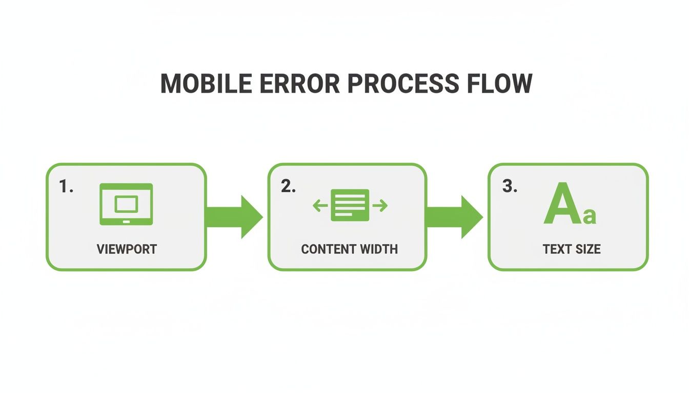
As you can see, fixing the viewport is almost always the first step. Get that right, and you’ll often find that issues with content width and text size resolve themselves.
Another fantastic option is to use an SEO crawler like Screaming Frog or Sitebulb. These tools can be configured to plug directly into the PageSpeed Insights API. You just kick off a crawl, and the software fetches mobile-friendliness data for every URL it finds. The report gives you a sortable, filterable list of all your pages, making it dead simple to spot patterns—like if every page using a specific template is suddenly failing.
Programmatic SEO isn't just about creating content at scale; it's about maintaining quality at scale. Automating your mobile-friendliness checks transforms quality control from a chore into a competitive advantage.
This level of automation is critical in mobile-heavy markets. In Germany, for example, smartphone penetration has hit over 92%, and it’s 99% among 18-24-year-olds. A Google study found that 61% of users will ditch a problematic mobile site, and 40% will head straight to a competitor. That’s a brutal reality in a market where Google handles 95% of searches. You can explore more about Germany's mobile e-commerce landscape to really understand what’s at stake.
By setting up these automated checks, you create a powerful quality assurance safety net. You'll catch errors from new template updates or buggy code before they ever affect your rankings or annoy your users. It turns mobile optimisation from a reactive headache into a proactive, scalable strength. For even more ways to optimise at scale, see how effective caching strategies can boost your site performance.
Future Proofing Your Mobile SEO Strategy
Getting the green light from Google's Mobile-Friendly Test is just the beginning. It's the starting line, not the finish. The real win is crafting a genuinely seamless experience for every single user, no matter what device or browser they’re on. To truly future-proof your mobile SEO, you have to move beyond a simple pass/fail mentality and commit to building a high-quality mobile presence from the ground up.
That means looking past your own phone and your own testing environment. A great user experience has to be consistent for everyone, everywhere.
Embrace Cross-Browser Compatibility
It's tempting to build and test exclusively for Chrome, but that’s a risky assumption, especially when you’re operating in diverse markets. While Google’s browser might be dominant overall, a huge chunk of your audience could be using Safari, Firefox, or Samsung Internet. If your site looks perfect in Chrome but falls apart on an iPhone, you're shutting the door on a massive segment of potential users.
Take Germany, for example. Chrome leads the mobile browser market with a 53.42% share, but Safari is right behind it at 30.24%. Then you have Samsung Internet chipping in another 9.22%. The data makes it crystal clear: for any serious programmatic SEO project, cross-browser compatibility isn't just a nice-to-have; it's non-negotiable. You can dig into more details on the German mobile browser landscape on Statcounter.
A "pass" on a Google tool just confirms technical compliance for Google's crawler. A truly future-proof site delivers a flawless experience for a human user on Safari, Firefox, or any other browser.
This is exactly where tools like BrowserStack become so valuable. They give you the power to test your website across hundreds of real device and browser combinations without needing a lab full of physical phones and tablets.
Here’s a glimpse of the BrowserStack dashboard, showing just how many testing options are at your fingertips.
This kind of virtual testing environment lets you instantly see how your pages render on a specific iPhone model using Safari, making sure your design and functionality hold up no matter where they're viewed.
Connect Mobile Design to Core Web Vitals
A clean, well-structured mobile layout directly feeds into your Core Web Vitals (CWV). These metrics—Largest Contentful Paint (LCP), Cumulative Layout Shift (CLS), and Interaction to Next Paint (INP)—are critical for ranking. They're especially sensitive on mobile devices, which often deal with slower connections and smaller screens.
Think about how common mobile issues tank your CWV scores:
- Slow-Loading Hero Images: A huge, unoptimised image at the top of your mobile page is a direct hit to your LCP score, as it's often the largest element in the viewport.
- Shifting Ads or Banners: Ads that pop in late and shove content down the page are a classic cause of a poor CLS score. It’s jarring and incredibly frustrating for users.
- Laggy Interactive Elements: Buttons, menus, or accordions that are slow to respond to a tap will drag down your INP, signalling a sluggish and unresponsive interface to Google.
Optimising for mobile-friendliness isn't a separate task from optimising for Core Web Vitals—they are two sides of the same coin. A fast, stable, and responsive mobile design naturally produces better CWV scores. This integrated approach ensures your site doesn’t just pass a technical check but also delivers the speed and stability users expect, helping to secure your rankings for the long term. For more advanced performance strategies, you might want to read our article on leveraging edge computing for pSEO.
Common Questions About Mobile SEO
Look, the world of mobile SEO can feel like it's always in flux. Tools change, best practices evolve, and it's easy to get tangled up in the details. Let's clear up some of the most common questions I hear so you can get back to what matters—building a great mobile experience.
If Google Retired the Mobile-Friendly Test Tool, Why Should I Still Care?
Because Google didn't get rid of the concept, just the standalone webpage for it. The principles behind that old tool are actually more critical now than ever, all thanks to mobile-first indexing. This isn't just a buzzword; it means Google’s smartphone crawler is its primary tool for indexing and ranking pretty much every website on the internet.
All the core ideas of the old test—readable text, a proper viewport, and easy-to-tap buttons—are now baked into broader user experience signals. Google still checks for all of it, just through tools like PageSpeed Insights and its Search Console reports. Ignoring these fundamentals is like showing a broken, unreadable website to Google's most important crawler. That's a surefire way to hurt your rankings.
What’s the Easiest Way to Check My Entire Site for Mobile Issues?
For a full, site-wide audit, your best bet is to pair an SEO crawler with Google's own APIs. It’s the only practical way to do this at scale.
- Fire up a crawler: Tools like Screaming Frog or Sitebulb can crawl every single URL on your website.
- Plug into the API: You can configure these crawlers to hook directly into the PageSpeed Insights API.
- Get the data: As the tool crawls your site, it automatically fetches mobile-friendliness data for every single page.
This approach gives you a comprehensive, sortable list of every URL that fails the mobile check. For a programmatic SEO project with thousands of pages, it's the only feasible way to spot patterns and prioritise your fixes.
A site-wide audit isn't just about finding one-off errors. The real goal is to find systemic template flaws. Fixing one template can instantly resolve issues across thousands of pages. That’s what we call a high-leverage fix.
Can a Page Pass the Mobile-Friendly Test but Still Have Bad Mobile SEO?
Absolutely. This is a trap a lot of people fall into. Passing the basic "mobile-friendly" check is just a technical baseline. It really just confirms the bare minimum, like your font isn't microscopic and your content actually fits on the screen.
But that simple check doesn't measure critical user experience factors, such as:
- Mobile Page Speed: A page can be technically "friendly" but load so slowly on a 4G connection that users just give up.
- Intrusive Interstitials: Those annoying full-screen pop-ups that block content? They create a terrible mobile experience, even if the page "passes."
- Poor Core Web Vitals: A page might suffer from a high Cumulative Layout Shift (CLS) because of ads that jump around, making it a nightmare to use.
True mobile SEO is a two-part equation. You have to pass the technical check and deliver a fast, smooth, and intuitive experience for every visitor on a phone. Getting that "pass" is just the ticket to entry; the real work is optimising the entire user journey.
Ready to scale your content strategy with a mobile-first approach? The Programmatic SEO Hub offers free guides, templates, and systems to help you build high-quality, search-friendly content that performs flawlessly on any device. Explore our resources today.
Related Articles

A Practical Guide to Competitive Analysis Keywords
When we talk about competitive analysis keywords, we're really talking about the search terms that are already making money for your rivals. By digging into these, you uncover their entire...

Landing Pages SEO A Practical Guide to Rank and Convert
When we talk about SEO for landing pages, we're not just talking about general website optimisation. We're getting hyper-specific. This is the art of building and refining standalone pages...

A Modern Guide to AI-Powered SEO Content Marketing
At its heart, SEO content marketing is all about becoming the best, most helpful answer to the questions your ideal customers are typing into Google. It's the art of creating and sharing...