A Complete Guide to the Google Mobile Friendly Test

The Google Mobile-Friendly Test is a free tool that gives you a quick, clear answer to one simple question: is your website easy to use on a mobile device? For any modern site, passing this test isn’t optional. It’s the baseline—a fundamental requirement for getting seen in search results, especially since Google now predominantly uses the mobile version of your site for indexing and ranking.
Why Mobile-Friendliness Is Critical for Modern SEO

It’s tempting to think of mobile-friendliness as "solved," but its impact on SEO has only grown stronger. This is about so much more than just having a website that shrinks down to a smaller screen. Today, mobile usability is a direct signal to Google about your site's overall quality and relevance.
The core reason is mobile-first indexing. This concept has been around for a while, but its real weight is still often underestimated. Google’s crawler now primarily looks at the mobile version of your content to decide how to rank you. If your mobile site is broken, slow, or a pain to navigate, that’s the version Google sees and judges. You can learn more about this in our detailed guide on mobile-first indexing.
The Ripple Effect of a Poor Mobile Experience
A clunky mobile experience creates a toxic chain reaction that tanks your SEO performance. When users land on a page and have to pinch-to-zoom, tap the wrong button because targets are too close, or just wait for content to load, they leave. Simple as that.
This behaviour shows up in your analytics as clear distress signals:
- High Bounce Rates: Users hit the back button almost immediately.
- Low Session Durations: Visitors aren't sticking around to explore.
- Reduced Conversions: Frustrated users will never complete a purchase or fill out a form.
These metrics scream to Google that your page isn't solving the user's problem. As a result, your rankings drop, and all that traffic goes straight to competitors who invested in a seamless mobile experience.
The Scale of the Problem in Programmatic SEO
For programmatic SEO sites generating thousands or even millions of pages, a tiny mobile issue can escalate into a full-blown catastrophe. Think about a single template error that causes a horizontal scrollbar on every one of your 10,000 product pages.
I once worked with a client whose traffic nosedived by over 40% in a few weeks. The culprit? A minor CSS update had pushed a sidebar just off-screen on mobile, making the content a hassle to read. The Google Mobile-Friendly Test flagged the "Content wider than screen" error across their entire site. The fix was easy, but the damage was already done.
At scale, even the smallest mobile layout flaw gets amplified. A one-pixel error on one page is a nuisance; that same error on 100,000 pages is an SEO disaster, signalling poor quality to Google across a huge portion of your site.
This is exactly why ongoing monitoring is non-negotiable. A site that passes the test today could easily fail tomorrow after a seemingly innocent update.
Future-Proofing for an AI-Powered Search Future
Looking ahead, mobile-friendliness is becoming even more foundational. As Google rolls out AI Overviews and other generative AI features, it needs clean, structured, and accessible content to train on.
A mobile-optimised site, by its very nature, tends to have well-organised HTML and a clear content hierarchy. This structure makes it far easier for AI models to parse, understand, and use your information to generate helpful answers. A messy mobile site, on the other hand, provides garbage data, making it less likely your content will ever be featured.
This context is especially vital in markets like Germany, where mobile connections are expected to hit 110 million by the end of 2025—a staggering 131% of the population. This figure, inflated by multi-SIM usage, points to a mobile-first environment where 66% of online shoppers prefer making purchases on their phones. Failing to optimise for these users isn't just an SEO mistake; it's a direct loss of revenue. Beyond the basics, a truly winning site needs a holistic approach to website performance optimization.
How To Run Your First Google Mobile-Friendly Test
Jumping into the Google Mobile-Friendly Test is easy, but the real magic happens when you understand what’s going on behind the curtain. Think of it less as a simple pass/fail grade and more as your first glimpse into how Googlebot actually sees your site on a tiny screen.
First things first, you'll head over to Google's official testing page. From there, just pop in the full URL of the page you want to check out. This could be your homepage, a brand-new blog post, or a crucial product page.

Once you hit "Test URL," the tool gets to work. It mimics how a Googlebot smartphone crawler would visit your page, fetching and rendering the content exactly as it would for indexing.
Live URL vs. Indexed Version
Here's where a lot of people get tripped up: understanding what the tool is actually testing. The Mobile-Friendly Test analyses the live version of your URL. This is perfect for checking changes you just deployed or testing a page on a staging server before pushing it live.
But this isn't necessarily what Google is using to rank you right now. For that insight, you need to look at Google Search Console.
The URL Inspection tool inside Search Console shows you the indexed version of your page—the last snapshot Google took. A page might pass the live test with flying colours, but if Google hasn't recrawled it yet, an older, non-mobile-friendly version could still be dragging down your rankings.
We cover how to use these tools in tandem in our guide to Google Search Console.
Interpreting the Results
After the analysis wraps up, you'll get a very clear "Page is mobile-friendly" or "Page is not mobile-friendly" verdict. The real gold, however, is in the details that come with it.
The tool gives you a few key bits of information to help you dig deeper:
- A Rendered Screenshot: You'll see a visual snapshot of how Googlebot renders your page on a mobile device. This is brilliant for spotting obvious layout disasters, like content spilling off the screen or text that’s too small to read.
- Page Loading Issues: The test also flags any page resources it couldn't load, like certain CSS files, JavaScript, or images. If critical files are blocked (maybe by your
robots.txt), the tool can't render the page correctly, which often leads to a false negative. - Specific Error Details: If your page fails, Google tells you exactly why. You'll see explicit reasons like "Content wider than screen" or "Clickable elements too close together."
While Google's tool is the go-to for SEO, it's also smart to understand broader methods for how to mobile-test a website. Taking a more holistic view ensures your site isn't just technically compliant but genuinely easy and pleasant for a real person to use.
Decoding Results and Fixing Common Mobile Issues
So, you've run the Google Mobile-Friendly Test and have a result. A green "Page is mobile-friendly" message is great, but the real gold is in the failures. Understanding why a page fails is the first step toward making real improvements that Google—and your users—will reward.
The tool doesn't just give you a simple pass or fail. It shows you a screenshot of how Google's bot rendered the page and lists out the specific roadblocks it hit. Issues like a misconfigured viewport or sluggish load times are incredibly common. In fact, Google's own data suggests these problems contribute to roughly 40% of troubled user visits.
For any business, that's a huge deal. Take Germany, where a whopping 66% of consumers turn to their mobile devices for shopping. If your site isn't up to scratch, you're practically handing those customers over to your competitors.
The Viewport Is Not Configured
This is probably the most frequent error you'll come across, and it's a foundational one. The "viewport" is just the visible area of your webpage on a screen. Without the right instructions, a mobile browser defaults to showing the desktop version, forcing users to pinch and zoom just to navigate. It's a terrible first impression.
Luckily, the fix is usually a quick one-liner. You just need to pop a specific meta tag into the <head> section of your HTML:
<meta name="viewport" content="width=device-width, initial-scale=1.0">
This little piece of code tells the browser two critical things: make the page width match the device's screen width, and set the initial zoom level to 100%. It’s the absolute cornerstone of responsive design.
Content Wider Than Screen
See this error? It’s a classic symptom of either a missing viewport tag or a design that’s too rigid. It forces users into that dreaded horizontal scroll to see everything on the page—a cardinal sin of mobile user experience.
The culprit is almost always CSS that uses fixed pixel widths. For instance, if you have a div set to width: 900px;, it's going to break the layout on any phone screen.
To sort this out:
- Embrace Relative Widths: Ditch fixed pixels for percentages (
width: 100%;) or viewport units (width: 100vw;). This lets elements flex to fit the screen. - Tame Large Images: An image with a fixed width can easily overflow. Applying
max-width: 100%;in your CSS is a simple, effective safeguard. - Use Responsive Breakpoints: Media queries are your best friend here. They let you apply different styles for different screen sizes, ensuring your layout adapts gracefully.
Text Too Small to Read
If your visitors have to pinch-to-zoom just to read your content, you've already lost them. Google flags this when your font size is simply too small for comfortable reading on a mobile device.
A solid rule of thumb is to start with a base font size of at least 16px for your main body text. It’s widely seen as the minimum for good readability. From there, you can use relative units like em or rem for your headings and other text, which allows them to scale in proportion.
Pro Tip: Don't just focus on the font size. Line height is equally important for readability. Good spacing between lines makes text much easier to scan. A
line-heightof around 1.5 is a great starting point.
Clickable Elements Too Close Together
Ever tried to tap a link on your phone only to hit the one next to it by mistake? That’s "fat finger" syndrome, and it's what this error is all about. It happens when buttons, links, or other interactive elements are jammed too close together.
Google's guidelines recommend that touch targets should be at least 48x48 pixels in size. Just as critical is the space between them. Aim for at least 8px of margin or padding to give users enough breathing room to tap with confidence. The speed and responsiveness of these elements also play a huge role, which ties directly into the broader effort of improving your Core Web Vitals.
Common Mobile Friendly Errors and How to Fix Them
To make this all a bit more digestible, here’s a quick-reference table that summarises these common issues. It's a handy guide for pinpointing problems, whether you're fixing them yourself or briefing a developer.
| Error Message | Common Cause | How to Fix It |
|---|---|---|
| Viewport not set | The <meta name="viewport"> tag is missing or configured incorrectly in the HTML <head>. |
Add <meta name="viewport" content="width=device-width, initial-scale=1.0"> to your HTML. |
| Content wider than screen | An element has a fixed width (e.g., width: 800px;) that forces horizontal scrolling on smaller screens. |
Use relative units (width: 100%;) or responsive breakpoints. Set max-width: 100%; on images. |
| Text too small to read | The font size is too small for easy reading on a mobile device, forcing users to zoom in. | Set a base font size of at least 16px for body text. Use relative units for other text elements. |
| Clickable elements too close | Buttons, links, and other touch targets are too small or packed too tightly together, causing mis-taps. | Make touch targets at least 48x48 pixels and ensure at least 8px of space between them. |
By working through these common errors flagged by the test, you're not just ticking a box for Google. You’re directly improving your site's usability, which keeps people on your pages longer and sends all the right signals to strengthen your overall SEO.
How AI Can Supercharge Programmatic SEO
Manually checking a handful of pages is simple. But what about a programmatic SEO site with thousands of pages? Checking them by hand is impossible. This is where you can combine a clever, automated setup with AI to not just find problems, but to generate and optimize content at a massive scale. Let’s demystify how this works in a practical way, without all the technical jargon.
Step 1: Gather Your Data Foundation
First, you need a starting point. Think of this as the raw material for your AI. This is usually a simple list in a Google Sheet or an Airtable database. For example, if you have a travel site, your data might be a list of cities. If you sell car parts, it could be a list of car models. This data is the "seed" for all the pages you'll create.
Each row represents a future page (e.g., "Best Restaurants in Berlin"), and the columns contain key data points (e.g., city name, country, popular dishes).
Step 2: Use AI to Enrich and Expand Your Content
This is where the magic happens. You’ll use an AI model like GPT-4 to take your basic data and turn it into unique, helpful content for each page. The key is giving the AI a very specific recipe, or "prompt."
Instead of just telling the AI, "Write about restaurants in Berlin," you give it a structured command:
"You are a helpful travel writer. Using the data [City: Berlin, Country: Germany], write a 200-word introduction about the dining scene in Berlin. Mention its unique culinary history and one famous local dish. Write in a friendly and engaging tone."
By creating a detailed prompt template, you ensure the AI generates consistent, high-quality text for thousands of pages, each uniquely tailored to the data in that row.
Step 3: Automate the Entire Workflow with No-Code Tools
You don't need to be a programmer to connect these pieces. Tools like Make.com or Zapier act as the glue. Here’s a simple, beginner-friendly workflow:
- Trigger: Set your automation to watch your Google Sheet. When you add a new row (a new city), the process starts.
- AI Generation: The automation tool sends the data from that new row to the AI (like OpenAI’s GPT-4) along with your pre-written prompt template.
- Content Creation: The AI generates the text based on your instructions.
- Publish: The tool then takes the newly generated text and automatically creates a new draft post in your website's CMS, like WordPress or Webflow.
With this setup, adding a single line to a spreadsheet can automatically trigger the creation of a fully written, SEO-optimized article, ready for your review. This is how you scale content creation from one page a day to hundreds.
This flowchart illustrates the exact process for tackling the errors your automated system will uncover.
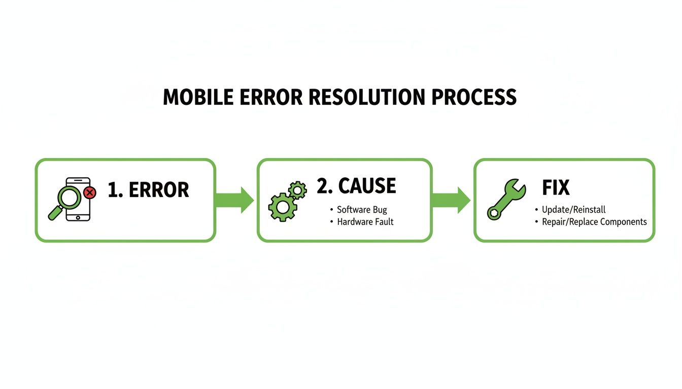
The visualization breaks down the resolution process into three clear stages: identifying the error, understanding its root cause, and applying the correct fix.
AI for Optimization, Not Just Creation
Beyond writing, AI can also help you optimize. You can create prompts that:
- Generate Meta Descriptions: "Write a compelling meta description under 155 characters for a page about 'things to do in Paris'."
- Suggest Internal Links: "Based on this article about Parisian museums, suggest 3 other related topics to link to."
- Create Structured Data: "Generate the FAQ schema markup for the following questions and answers."
By integrating AI into your workflow, you move from manually building one page at a time to overseeing an automated content factory. You focus on strategy—finding the right data and crafting the perfect prompts—while the technology handles the repetitive work of content creation and publishing.
Building Mobile Friendliness into Your Workflow
Fixing mobile errors after they've already started tanking your rankings is a frustrating, reactive game. The best strategy is to prevent these problems from ever seeing the light of day.
This means weaving mobile-first thinking directly into your development and content workflows. Mobile optimisation shouldn't be a last-minute patch; it should be the default setting.
For programmatic SEO, this all begins with your page templates. Think of a well-built template as your insurance policy—it guarantees that every single page you generate is born mobile-friendly. Instead of chasing down 10,000 broken pages, you perfect one template and scale flawlessly.
Designing Responsive Templates from the Start
Your templates are the DNA of your site. If they aren't flexible from the get-go, you're setting yourself up for failure. Rigid, fixed-width designs are the number one cause of the usability errors flagged by Google's Mobile-Friendly Test.
To build truly responsive templates, your team needs to obsess over a few key things:
- Flexible Grid Layouts: Forget fixed pixel widths. Use modern CSS like Grid or Flexbox to create layouts that automatically adapt to any screen. Everything should be built with relative units like percentages.
- Responsive Images: This is non-negotiable. Every image must have the
max-width: 100%;CSS rule. It’s a simple line of code that stops oversized images from breaking the layout and causing that dreaded horizontal scrollbar. - Adequate Touch Targets: Before a single line of code is written, the design itself should account for touch. All buttons, links, and navigation elements have to be big enough to tap easily. A minimum size of 48x48 pixels with at least 8px of spacing is a great rule of thumb to avoid user rage-quitting.
Bake these principles into your templates from day one. When mobile-friendliness is the default, every new page automatically inherits these crucial traits, drastically cutting down your risk of widespread errors.
Making Pre-Publication Testing Mandatory
A solid template is a great start, but entropy happens. A minor code change or a new content module can unintentionally break the mobile experience. That’s why a staging environment is absolutely critical.
A staging site is a private, exact copy of your live website. It's your sandbox—a place to test updates safely before your users (and Google) ever see them.
Before any new template or major content update goes live, it must pass a mandatory mobile check-up. This doesn't have to be a huge, complicated process. Just create a simple checklist for your team to run through on the staging server.
Pre-Launch Mobile Checklist:
- Run the URL through the official Google Mobile-Friendly Test.
- Pop open browser dev tools and simulate different device sizes (iPhone, Samsung Galaxy, etc.).
- Do a quick manual test on at least one real iOS and one real Android device.
- Physically tap on all clickable elements. Are they easy to hit? Are they spaced out enough?
- Flick the screen side-to-side. Is there any horizontal scrolling?
This simple habit shifts mobile optimisation from a reactive headache to a proactive quality gate. For programmatic sites, integrating this into a CI/CD pipeline is the ultimate way to automate these checks. You can learn more about that in our guide to CI/CD for content automation. It’s a workflow that stops regressions in their tracks and makes mobile excellence a natural part of your publishing routine.
Common Questions About Mobile Friendliness
When you get deep into mobile optimisation, a few common questions always seem to pop up. Let's tackle the ones I hear most often from SEOs, developers, and founders trying to make sense of the Google Mobile-Friendly Test.
Does Passing the Test Guarantee High Rankings?
Passing the test is a critical piece of the puzzle, but it’s not a golden ticket to the top spot. Think of it this way: since Google switched to mobile-first indexing, being mobile-friendly is just the price of admission. Failing the test will almost certainly tank your rankings in mobile search.
But passing is just one of many signals. You still need everything else that makes a site great: high-quality content, a solid backlink profile, and strong overall site authority.
It's the bare minimum to compete. You can't get in the game without it, but it doesn't automatically make you the winner. It just gets you on the field.
My Site Passes the Test But Looks Terrible on My Phone. Why?
This is a classic—and super frustrating—scenario. The Google Mobile-Friendly Test is a bot, not a designer. It runs through a technical checklist to see if you meet specific criteria; it doesn't have an opinion on aesthetics or usability.
Your site might tick all the technical boxes for the test but still deliver a poor user experience. I've seen this happen due to:
- Awkward layouts that are technically responsive but feel completely unintuitive to use.
- Clashing colour schemes that make text an absolute pain to read.
- Confusing navigation that meets the "touch target" size rule but is still a nightmare to tap through.
Use the test as your technical baseline, not the final word. Always, always do your own manual testing on real devices—grab an iPhone, an Android, anything—to make sure your site isn't just compliant, but genuinely easy and pleasant to use.
Can I Test Pages That Are Blocked by Robots.txt?
Nope, you won't get an accurate result. The tool needs to crawl and render your page's resources, like its CSS and JavaScript, exactly like Googlebot does. If your robots.txt file blocks Googlebot from grabbing these crucial files, the tool sees a broken, unstyled mess and will almost certainly fail it.
For a reliable test, you have to make sure Googlebot isn't disallowed from any resources essential for rendering the page. The best place to check for this is the URL Inspection tool inside Google Search Console. It will tell you straight up if key resources are being blocked.
Is the Standalone Mobile-Friendly Test Tool Still Relevant?
While the standalone tool is still handy for a quick spot-check on a single URL, its importance has definitely faded. Google has been baking these mobile metrics directly into its core platforms, which offer far more powerful insights.
For a true, ongoing picture of your site's mobile health, you need to be living in these tools:
- The 'Mobile Usability' report within Google Search Console.
- The PageSpeed Insights report, which now includes mobile usability audits.
These platforms give you site-wide monitoring over time, showing you trends and flagging issues across your entire domain. That's infinitely more valuable for serious SEO management than just testing one URL at a time. So, use the standalone tool for a quick peek, but rely on Search Console for the big picture.
Ready to scale your content strategy with mobile-first principles? The Programmatic SEO Hub provides the templates, guides, and systems you need to create high-quality, optimised content at scale. Explore our resources at https://programmatic-seo-hub.com/en.
Related Articles

Mobile friendly test google: A Practical Guide to Master Mobile SEO
Even though Google’s standalone Mobile-Friendly Test tool is a thing of the past, the principle behind it is more critical than ever. The simple truth is that Google now overwhelmingly uses its...

A Practical Guide to Competitive Analysis Keywords
When we talk about competitive analysis keywords, we're really talking about the search terms that are already making money for your rivals. By digging into these, you uncover their entire...

Landing Pages SEO A Practical Guide to Rank and Convert
When we talk about SEO for landing pages, we're not just talking about general website optimisation. We're getting hyper-specific. This is the art of building and refining standalone pages...